ShopDreamUp AI ArtDreamUp
Deviation Actions


Suggested Deviants


Suggested Collections


You Might Like…


Description
This is the exact same process as the Chun Li Colouring Tutorial. Slightly redundant? Oh yes. Do I care? Not really.
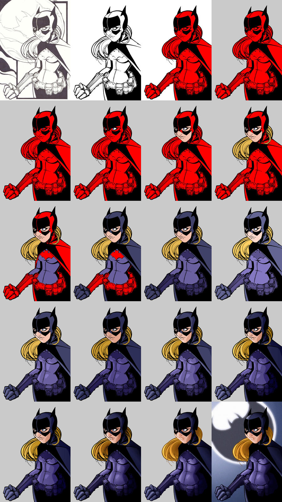
From top to bottom and left to right:
1. Original Lines
There are several ways of separating the lines from the white background. My method of choice is to copy the blue colour channel as a selection. You can do this by going into the Channel tab of the layers palette, and dragging the blue channel down to the copy icon (the one to the right of the dustbin/trashcan). You then need to invert the selection (Image/Adjustments/Invert). Now go back to the Layers tab and right click on the canvas. Click on Load Selection, then in the drop down bar next to Channel select Blue copy. You’ll now have a bunch of marching ants in the shape of your lines. All you need to do now is colour them (I use the paint bucket tool).
Note: Make sure you do this on a new (empty) layer. To get a new layer just press CTRL, ALT, SHIFT and N together.
2. Cleaner Lines
Cleaned up lines minus the background (which will return later).
3. Single Colour Flat
Not everyone does this, but I find it makes things easier. Especially when there are a lot of figures to be coloured (I use a different shade of red for each figure). Also worth mentioning, it’s best to colour the figures on a separate (empty) layer to the background and the lines. When colouring an image, what you’re effectively doing is colouring behind the lines, but in front of the background.
4. Single Colour Background
I find that grey is the least distracting colour for a background. It’s also the least likely colour to be used in a comic colouring (Superhero creators love their primary colours). Just use the paint bucket tool on the bottom layer to do this.
5-11. Flats
Now that you’ve got a template in the form of a single colour flat, all you need to do is duplicate this layer (right click on desired layer in layer palette and click on duplicate layer) and adjust the new layer to your desired colour (I use Hue/Saturation found in Image/Adjustments/Hue/Saturation, be sure to check the colorize box when doing this). Once you’ve done this just delete or paint away any part of the layer that shouldn’t be that colour. Repeat the process as many times as is necessary. Here I had to do it seven times. I then merge those colour layers and label them Flats (All layers should be labelled to save confusion. Not a problem with this colouring, but I’ve coloured images with over fifty layers and without labelling them it would’ve been impossible).
12. Highlight Adjustment
I then duplicate the Flats layer and lighten the bottom of the two layers using Brightness/Contrast (Image/Adjustment/Brightness/Contrast). The reasons for which will become apparent in the next step.
13. Hard Shading (highlights)
Now I need to add the highlights (I always start with the highlights then do the shadows). Using the Polygonal Lasso Tool I select and delete the sections that I feel the light would hit (or that would just look cool highlighted).
14. Shadow Adjustment
Now to do the same thing again, but for the shadows. Merge the two Flats layers then duplicate the newly merged layer. Now darken the bottom layer in Brightness/Contrast.
15. Hard Shading (shadows)
Again use the Polygonal Lasso Tool to select and delete the portions that need it. Then merge the two layers.
16. Gradient
To accentuate where the light is coming from I sometimes do a gradient adjustment. To do this you need to use the Quick Mask mode (just press Q), then select the Gradient tool from the Tools palette (it’s in the same location as the Paint Bucket). Make sure it’s the linear Gradient (the gradient types can be found third from the left on the Options bar). Then press and hold the left mouse button while pulling the cursor from left to right (or right to left depending on where the ‘light’ is coming from) across you canvas. You’ll then have half of you screen covered in transparent red. Press Q again to get back to Standard mode where you’ll see the red has turned into marching ants. You can now darken half of the image (or lighten the other half by inverting the selection).
17. Softening
I could leave it there, but I’ve gone off hard or cell shading lately. I now soften the hard shading using the Blur brush (the one that looks like a teardrop). I use the brush and not the filter because some things need to be softened more than others.
18. Soft Shading
For the more detailed shading I like to use the Dodge and Burn tools (the ones just to the right of the blur tool). It’s the closest I can get to pencil shading (something I’m very comfortable with).
19. Coloured Inks
I don’t always do this, but sometimes it can really make a colouring. I use the Polygonal Lasso tool to select a section of the lines (your top layer) then use Hue/Saturation to adjust the colour (again making sure to check the colorize box).
20. Final
I then added a simple background inspired by the original line art.
Voila.
Anyone have any questions or comments, don’t hesitate in sending me a note or commenting on this deviation.
Image size
3080x5480px 7.1 MB
© 2007 - 2024 billythebrain
Comments0
Join the community to add your comment. Already a deviant? Log In